Partners In Scale.

One purpose.
One integrated strategy.
Better performance.
Successful e-commerce requires an integrated strategy, with all components working in harmony. Here are our main areas of expertise:
E-Commerce
Grow your business with an expertly-designed Shopify or Magento website that is built bespoke for you. Customisable, scalable, and fully supported.
Paid Acquisition
Using a mix of Paid Search, Social, and Programmatic, we’ll help you reach your potential customers in an instant.
Organic Marketing
You don’t always have to pay to be seen; we’ve developed a range of services from SEO to Content Marketing to help you reach your target audience.
Explore All Our Services
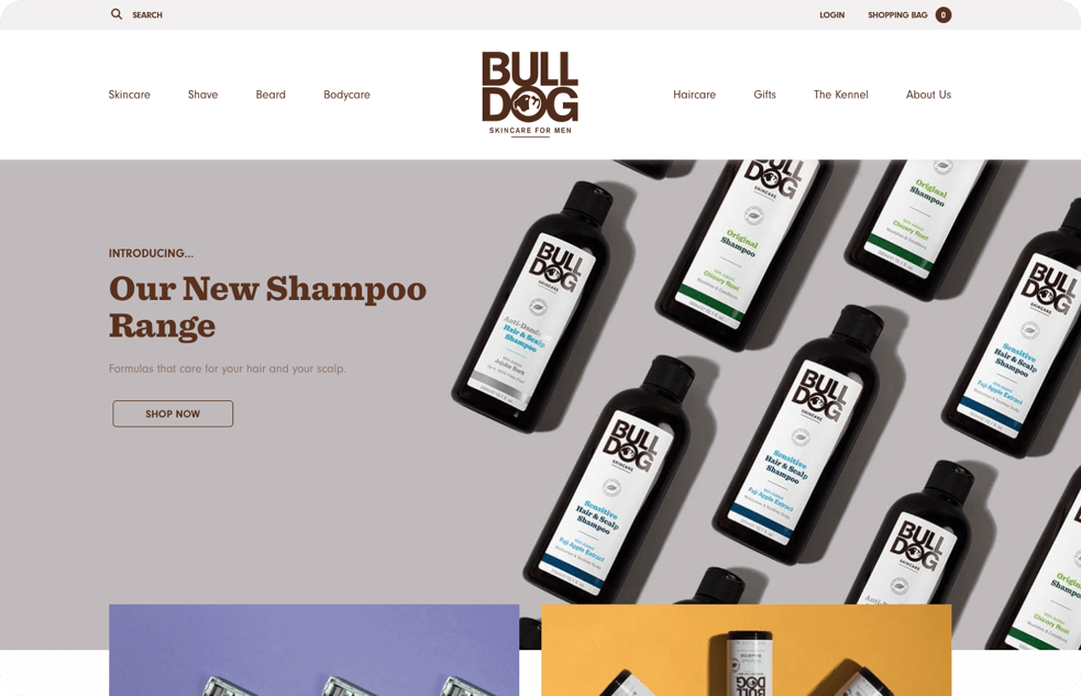
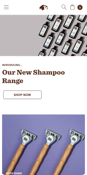
Bulldog Skincare increased conversions by 34.7% with some intuitive changes to their cart.

EBRD had a 3 month campaign set up to entice registrations to their new Know-How Academy. Gravytrain were able to push ads in over 20 countries with excellent results.
mycarcheck were able to see significant results from paid activity and a multi-stream social strategy, delivering more sessions, more clicks, and better revenue.